The things we fear most in organisations – fluctuations, disturbances, imbalances – are the primary sources of creativity. (Margaret J. Wheatley)
|
0 Comments
Whatever your topic is, consider it as a storytelling.
This approach can help you have a full structure and build the order of thoughts logically. Just as we learned in school that a composition needs introduction, discussion and ending. Sometimes this basic phasing is an advancement. Sometimes you need to devide the big blocks to further sub-elements. As the story requires. There are countries where defining and learning structrues are the inherent and every day activity of education. Like in France. Anyway, logical constructions are useful in presentation making. One simple tool of storytelling is creating the meaningful flow of thoughts by building up the headlines of slides accordingly. You cannot imagine how often this one is missing. Nevertheless, it can be a cross-check if we cover the topic fully. Of course, it might not be sufficient on its own, but it is still advisable to consciously address it. Okay, so let's see an example in relation with a corporate decision preparing material: 1. The customers don't make use of the service... (slide content: evolution of usage) 2. ... because they don't know how to use it... (slide content: market research results) 3. ...so they need education... (slide content: actions that address the pain points) 4. ...and its main message is 'You can do it'. (slide content: describing the communication campaign) 5. For this, we need resources (slide content: budget, capacity of front office) 6. Decision about launching the activities (slide content: wording of formal approval) So these are the headlines on the given slides and the slides illustrate these messages. If we do it right, even without illustrations we get a meaningful story by including some facts in the headlines. That's why we can start preparing our presentation by defining this train of thoughts. The challenge or the excitement of decision making is the uncertainty of lacking information. If we had all the relevant information or we knew the future there would be no real decision as the only rational way would be evident. Of course, that's not the case. That's why decision making is a key research area in psychology and maths. Actually many economic Nobel-prize winners did their studies in this topic. Think of John Nash and his game theory. Making a decision is taking a certain risk, no doubt about it. It can be exciting or frustrating depending on our risk taking attitude. The Myers–Briggs Type Indicator (MBTI) is an introspective self-report questionnaire designed to indicate psychological preferences in how people perceive the world and make decisions. The fourth dimension is heavily connected to decision making. The judging types like to "have matters settled", while the perceptive types prefer to "keep decisions open". So don't get surprised if you or others have some hard time when you have to decide something. But also that's why it is good to know some basic characteristics of decision making. 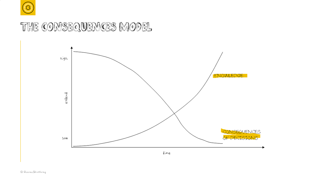 When you have little knowledge about the matter and you make a decision, the extent of consequences, being good or bad, is higher. While when time goes by and you have got to know more about the topic, it's easier to make the right calls, but the extent will be lower.
If you want to win big or quickly, you have to act in the early stages, but this can also result in a big failure because of the uncertainty. And if you want to be sure about your next move or you want to avoid losing much, try to gather as much information as you can, but know that you won't win much either. Don't be lazy to adjust the default settings! PowerPoint has a bunch of default settings to help us - and that's pretty useful in many cases. Nevertheless we get all the tiny little details as pre-defined, so we do not have to bother with those (e.g. the opacity of the background colour of a graph). However, this convenience can set us back: it can divert the focus from our message. The good illustration is the one that supports the message. To do that, get rid of all the redundant elements of the illustration. Like unnecessary colouring, unnecessary sub-lines, unnecessary categories and so on. Eliminating these has two major advantages: 1) it can decrease overcrowding; 2) it makes the message dominant, even if an extra element is needed (e.g. a text box). Let's see an example. We quickly define a graph by adding the data and click on OK. What do we get? 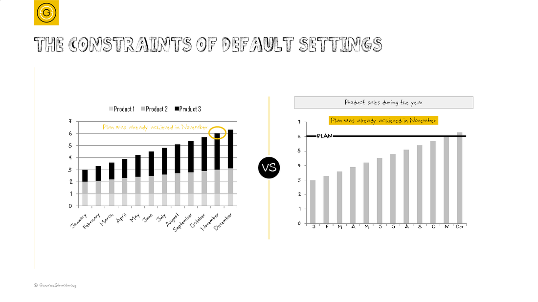 In this case, we have data about a whole year, month by month. The default settings show the full name of each month. But you know that from your early ages, so it is enough to refer to the common knowledge by the initial letter of the month. People will get it, believe me, and they don't have to learn the months from your presentation. You also had detailed data about three product types, but your message is about their joint performance - so do you really need to show all? Of course, not. So by getting rid of the unnecessary parts, you can focus on your message, you support it and only this, you can ease your structure up, and even add a new textbox for a headline to add some information if needed.
Don't get me wrong: there are cases when the months have their roles (e.g. when your starting point is not January). But in other cases, referring is enough. Consciousness is what matters here: if there is no value added, don't let the element remain in the graph, just because the default settings have had it be. Setting priorities is one of the most common management tasks as you could perform many actions, but your resources are limited. So you have to decide which one to be carried out first or which one you have to postpone. It's quite evident that you want to do the ones that are the most probable to have the maximum positive impact on your business. Therefore it's not enough to pick the one of the biggest impact that is pretty unlikely to be feasible (either you are simply not capable of doing that, or you need the resource you do not have, or you need some external influence). Also it's not enough to pick the one that you can surely carry out, but it does not have a major impact on your operation (e.g. paint your door to a different colour). 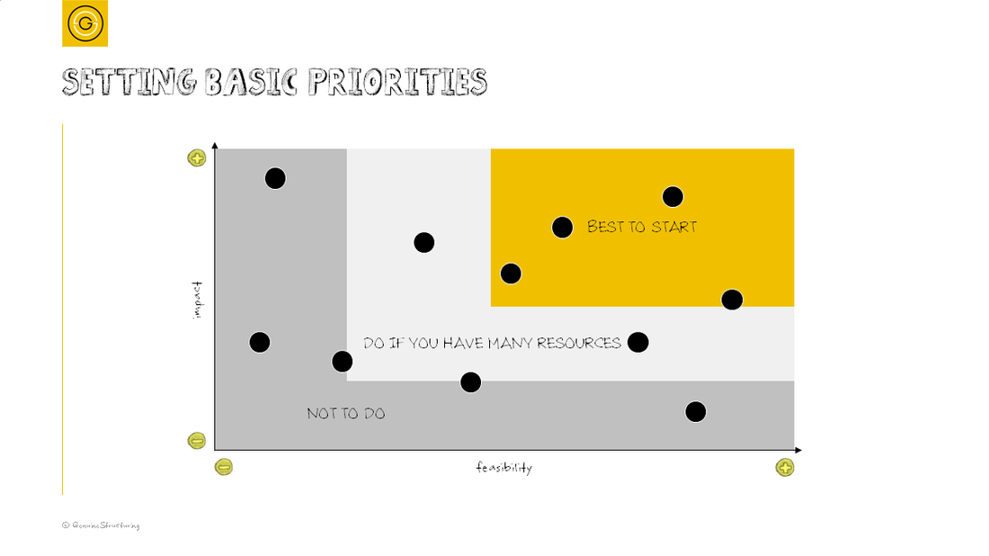 So start with the ones that you can do and that have great positive impact on your business, and do not mind stopping the ones that are unlikely to be feasible or that have small impact or not at all.
For a sophisticated design, you need to use meaningful items and use them to the necessary extent and no more. So you must avoid over-emphasizing. Marking the logical link among items, you can use simple arrows / triangles. Linking many to one may require something that groups the side of the multiple items meaning that a consequence comes from all of those. Keeping the arrow, but simply enlarging it to cover every item results in an emphatic element that distracts the attention from the message. The structure gets heavy, too much. Instead of that, use a size that still can show the connection, maybe use colouring for the right emphasis, but keep it minimal. In this way the logical flow still gets obvious, but you can have the attention on the content itself. 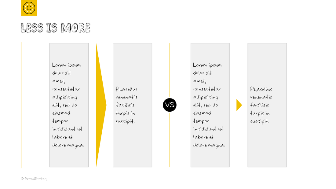 See how the big arrow gets dominant in the structure on the left side, while how a small arrow can define the connection and play supporting role on the right side. If the conclusion comes from many items, you can still have a solution in which you get the multiple items connected and keep the logical link minimal. 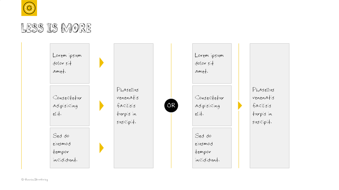 Either use tiny arrows for each element, or connect the elements with a thin line instead of a dominant shape.
Have you ever had to prioritize the tasks you had to do in the coming days or weeks? I'm sure you have. Either you had a logic how to do so (e.g. you started with the best one or the least favourable) or you were simply adrift by the events causing some unwanted stress, you somehow marked your tasks complete. Next time you might try something else. 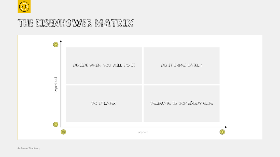 The Eisenhower matrix groups the tasks according to their importance and the timeframe they are due. Important tasks contribute to your long-term goals, while urgent tasks are the ones you feel you need to react to immediately.
The matrix helps you see what you have to do and what you must do. I wonder how often we have to deal with the urgent tasks that are important to someone else, but not to us. It's part of our work, but the extent is that matters. So by structuring your tasks via the Eisenhower matrix, you can focus on the right things. Its simplicity is what makes this approach a widely used decision making tool. US president, Dwight Eisenhower is said to have used this method during his productive life. |
Categories
All
Archives
August 2016
|
 RSS Feed
